
Digital Loan Application
My Role:
As the founding and sole designer on the Finance team, my responsibilities includeed developing design strategies, aligning them with key stakeholders, leading the end-to-end design process, and managing expectations across cross-functional teams.
Project Highlight:
Established global UI and UX standards for form design
97 SCAT of the digital loan application experience
The digital experience reduced loan team intervention touchpoint by 23%.
Team: 1 Product Manager • 1 Designer • 4 Engineers
Project Timeline: V1 - May 2021 - Oct. 2021 • V2 - Nov. 2023 - Dec. 2023
Quick Link: Final Design
New Finance Team Is Formed
Farmers Business Network is a platform that helps family farmers maximize their profit potential with data and technology. In 2021, a Finance product team was created to scale operations through technology, offering streamlined loan services. As the founding designer, my focus is on the middle of the funnel loan experience, and tasked with establishing foundational design standards for the loan application process.
Farmers Are Struggling With the Outdated Loan Process
The existing DocuSign-based system was inefficient for both farmers and FBN Finance. It lacked support for complex sections (like collateral), making it difficult for farmers to complete the application without assistance, which often led to errors, delays, and increased loan rates. For FBN, the dependence on human intervention at nearly every stage slowed down the scaling of operations.
Farmer Pain Points:
Struggled to complete applications without assistance.
Errors in applications led to delays, denials, or increased rates.
FBN Pain Points:
Dependent on human touchpoints for nearly every application.
Difficulty scaling to keep up with loan volume.
To address these issues, I worked with the PM to came up the problem statement:
How might we create an intuitive loan application process that empowers farmers to complete applications independently, reduces errors, and supports FBN Finance’s scalability?
Aligning Stakeholders Early On
One challenge was aligning key stakeholders on design details, as FBN had never implemented a fully digital application before. I led foundational design efforts for layout, interactions, and overall UX. To ensure we stayed focused, the PM and I spent the first three weeks conducting competitor analysis and stakeholder workshops, aligning priorities.
From these activities, I translated the problem statement into clear design goals:
Self Service: Simplified application, eliminated unnecessary initial questions, and provided contextual helper content.
Data Accuracy: Real-time error feedback, avoided jargon.
Application Security: Early identity verification and centralized document upload to prevent fraud and reduce email exchanges.
By setting clear goals and aligning with stakeholders early on, we avoided scope creep and created a solution that was user-centric, scalable, and secure.
Three Key Dimensions of Form UX
Based on Jessica Enders’s framework, there are three key dimensions to any form:
Content (what you say in the form and how you say it)
Flow (how the user moves through the form)
Layout (how things are presented visually)
Throughout the design process, working across teams, I tackled each area and have been tweaking based on the ongoing feedback from farmers.
Jump to…
Fewer, Shorter the Better
The original application included unnecessary questions based on the digital limitation. I worked with the loan team to audit the old form, we eliminated 23% of redundant or optional questions .
FORM DIMENSION - CONTENT
Light to Heavy, Easy to Hard
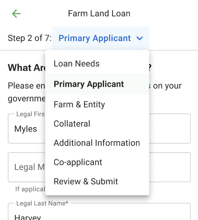
I reordered the questions to start with simple ones, gradually moving to more complex ones to build user confidence and commitment. After establishing the basics, I grouped questions into logical themes, which were reflected in the progress bar to guide users through the process.
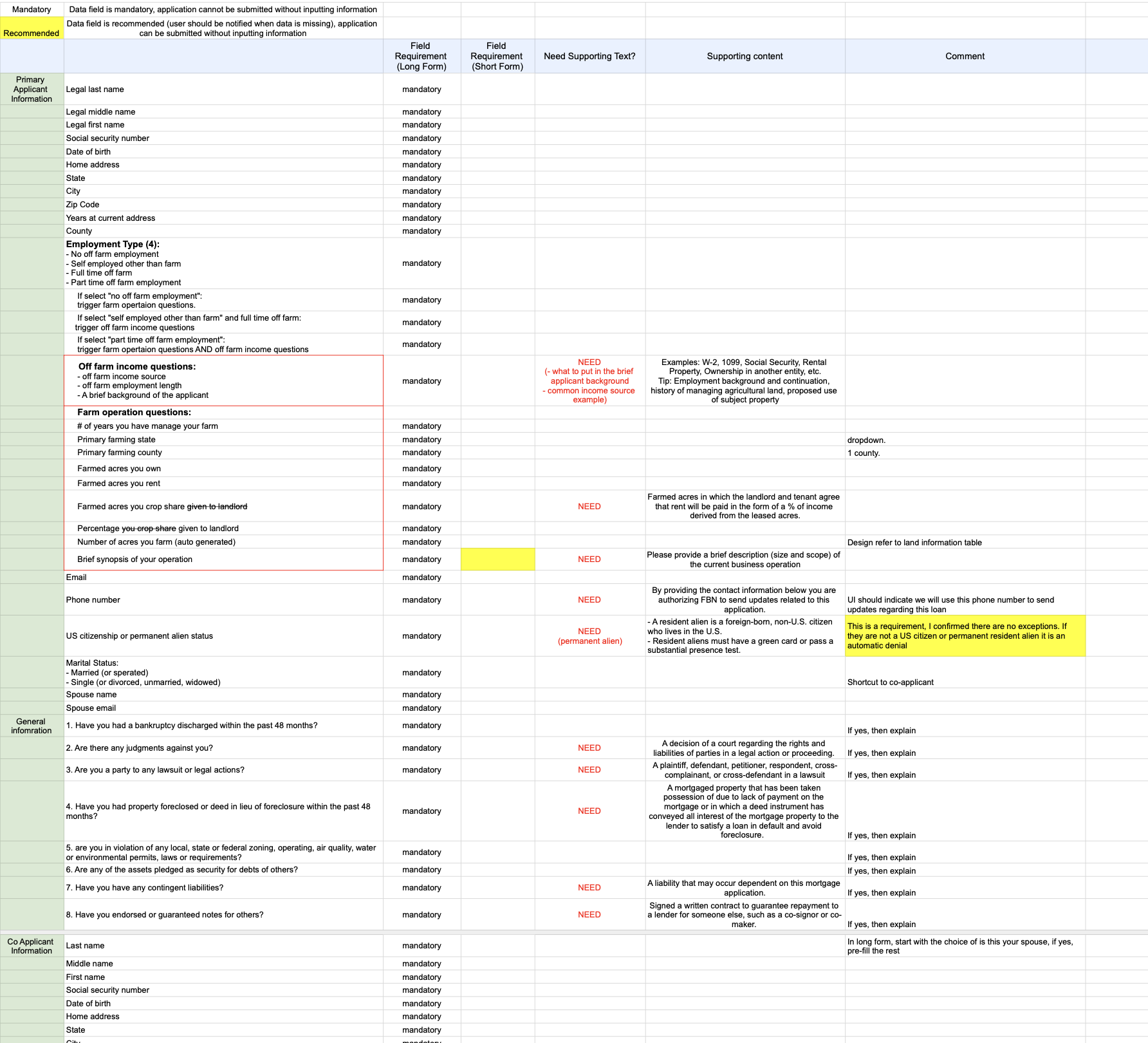
I document and categories all the data points along with its conditions and supporting text in Excel
Building Trust Through Credibility & Transparency
Our research revealed that many farmers were unfamiliar with FBN and unsure of its trustworthiness. To build trust, we highlighted FBN’s credibility upfront and explained how farmer data would be used throughout the application.
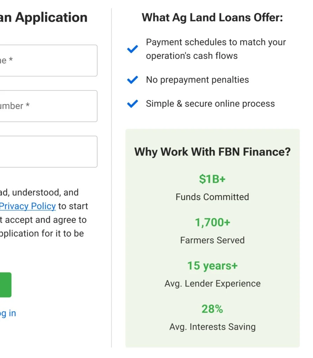
Loan Application Start Page - Right rail highlights what FBN offers
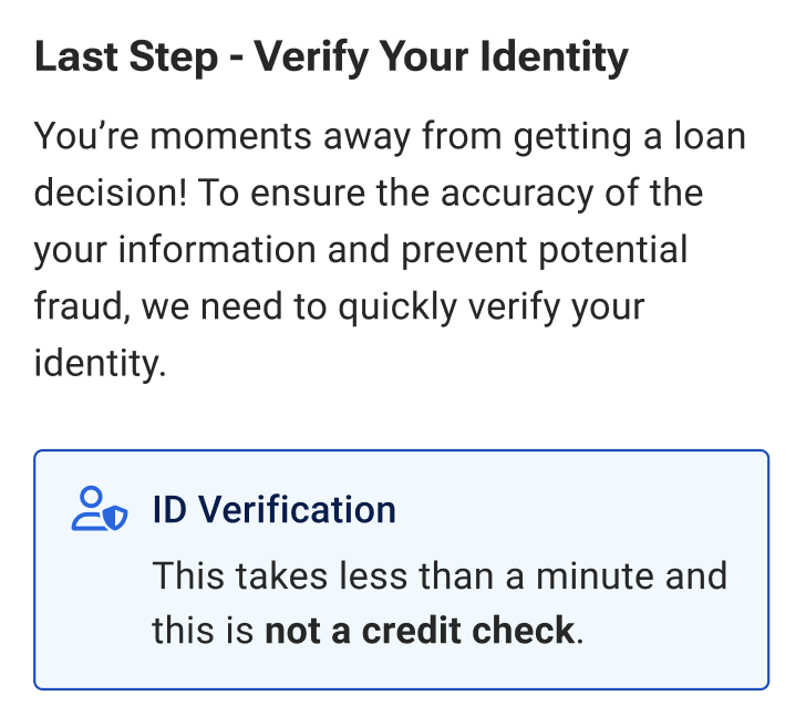
We highlighted why we ask farmers to verify their identity before submitting the application
Should the Flow Be Linear or Non-linear?
The loan team strongly favored non-linear flow, reasons being:
It behaves similar to DocuSign or traditional paper applications, and users are familiar with it.
It provides maximum flexibility.
Force the user to follow a certain sequence might lead to frustration, eventually leading to dropout.
On the other hand, I believe linear UX would work well in this use case. From a product point of view, It is naturally progressive, it is perfect for an MVP to evaluate ideas, and easy to iterate on it. From a design point of view, it removes a lot of unnecessary complications from the user experience and it allows better measurement of user journeys.
To convince the stakeholders, I prototype both linear and non-linear versions and ran an unmoderated test with 15 people. I alternated which version participants saw first to avoid any bias. The results were insightful: while ⅔ of the participants preferred linear flow for its clarity and ease of use, ⅓ of participants mentioned the appreciation for flexibility of a non-linear format.
FORM DIMENSION - FLOW
Application Flow Preference
Progress Bar for Clear Visibility
Transparency enhances user experience by showing where they are. So I introduce a progress bar that gives users clear visibility of their application status, and provides them flexibility to navigate back to previous sections if needed.
FORM DIMENSION - APPLICATION UI
Progress Bar - Mobile
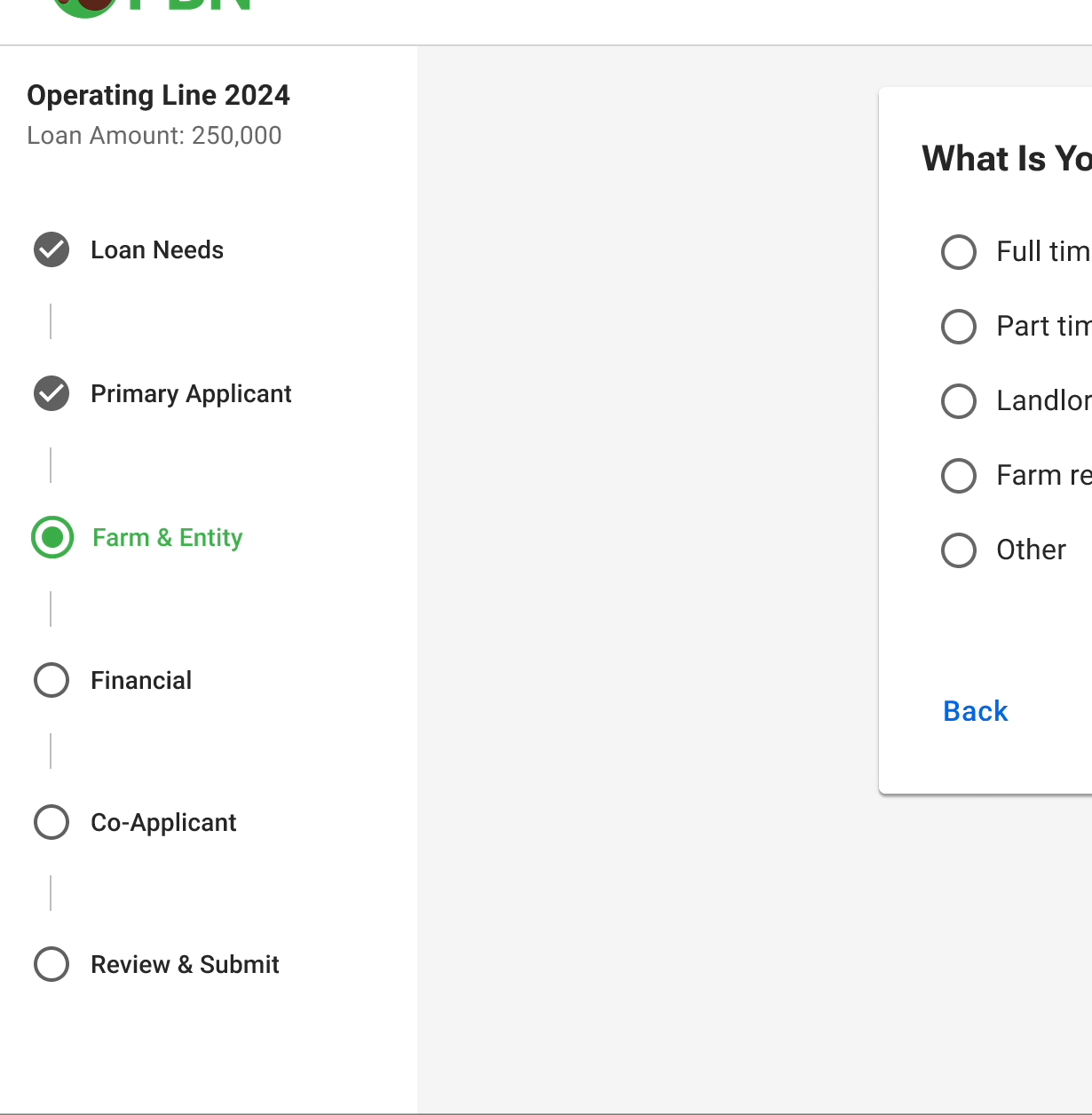
Progress Bar - Desktop
Hide It Till You Need It (a.k.a Progressive disclosure)
Progressive disclosure was key to reducing cognitive load and preventing the form from feeling overwhelming. I designed the form to reveal questions progressively, based on previous responses, ensuring users focus on one task at a time. This method not only simplified the process but also allowed for flexibility in handling various loan types, creating a more personalized and efficient experience.
This approach also provided flexibility in scaling to different loan types and enabled us to tailor subsequent questions based on the user’s previous answers. This would create a more personalized and efficient experience.
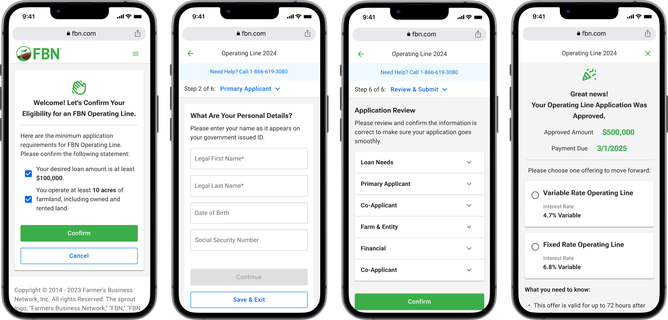
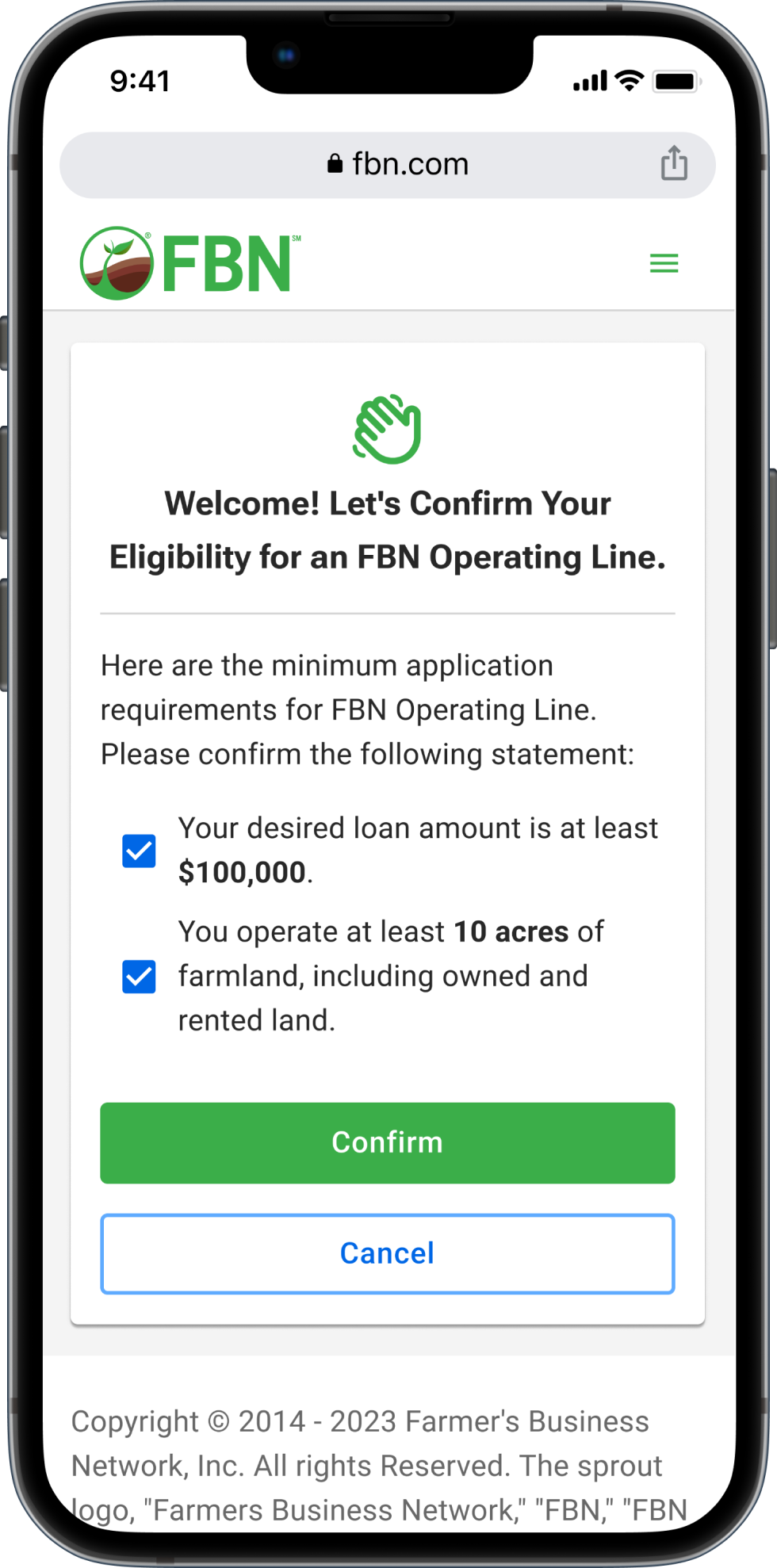
Eligibility Check
Farmers need to confirm the minimum requirements before starting a loan application.
This step ensures that farmers don’t accidentally start an application for which they do not qualify. It also helps reduce unqualified leads.
Final Design
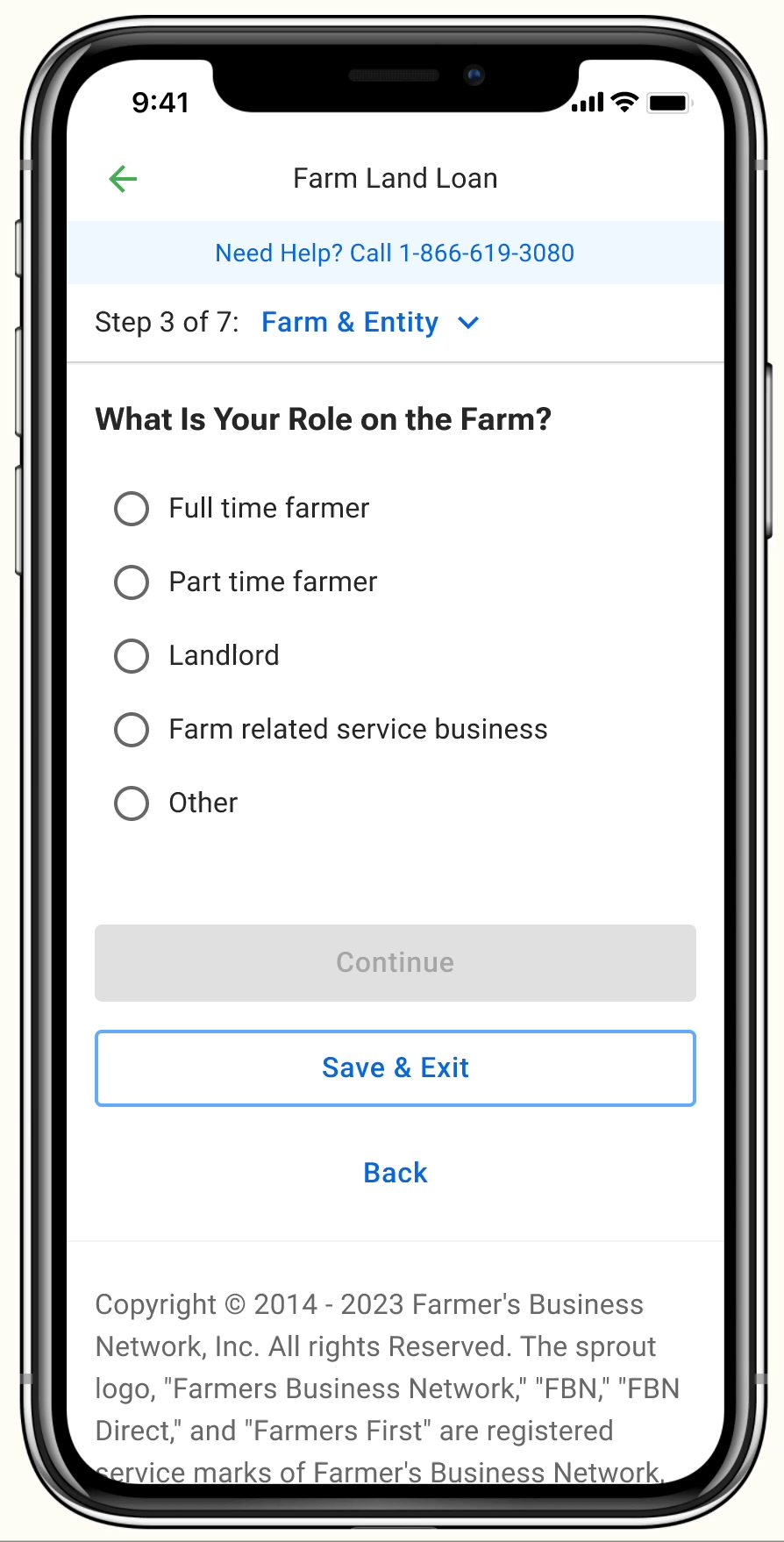
Application Form
An application experience that allows farmer to save it and comeback anytime.
A progress bar is introduced to give users clear visibility of their application status, and provides them flexibility to navigate back to previous sections if needed.
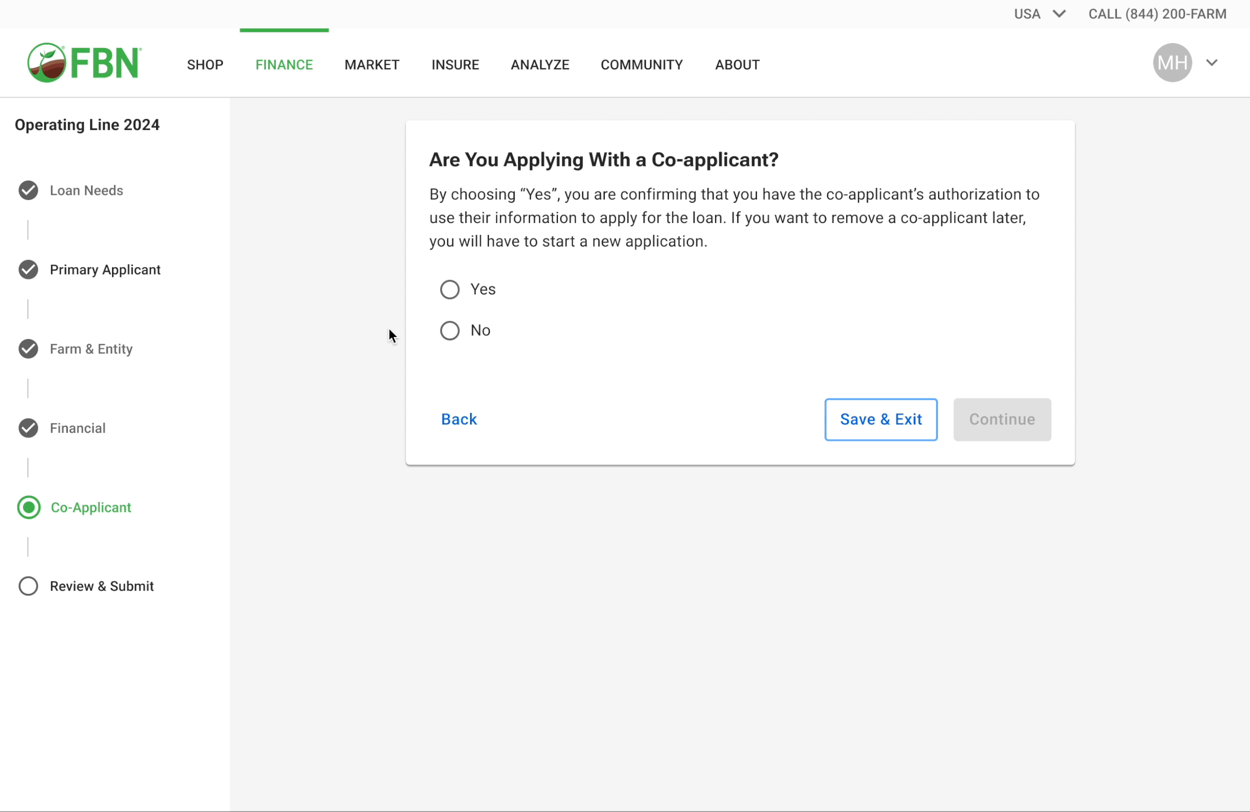
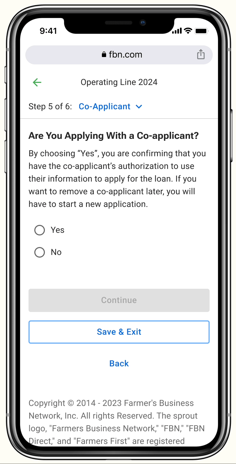
Co-Applicant
The application provides the primary applicant with the flexibility to either fill out information for co-applicant(s) or allow the co-applicant(s) to complete their own details.
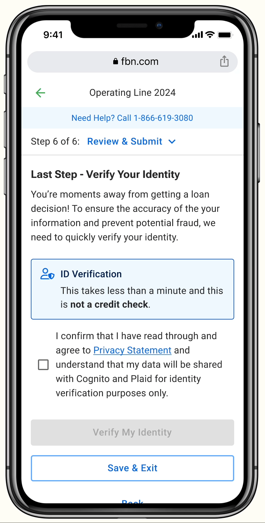
ID Verification
For certain loan versions, farmers are required to verify their identity before submitting the application. The process takes less than 1 minute with minimal input.
This ensures the accuracy of the provided information and helps prevent potential fraud.
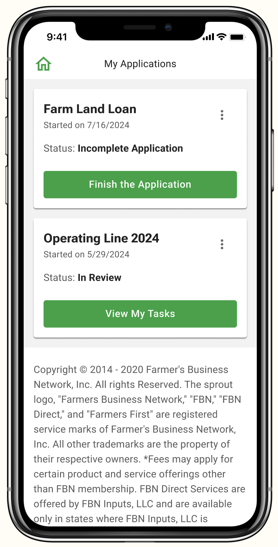
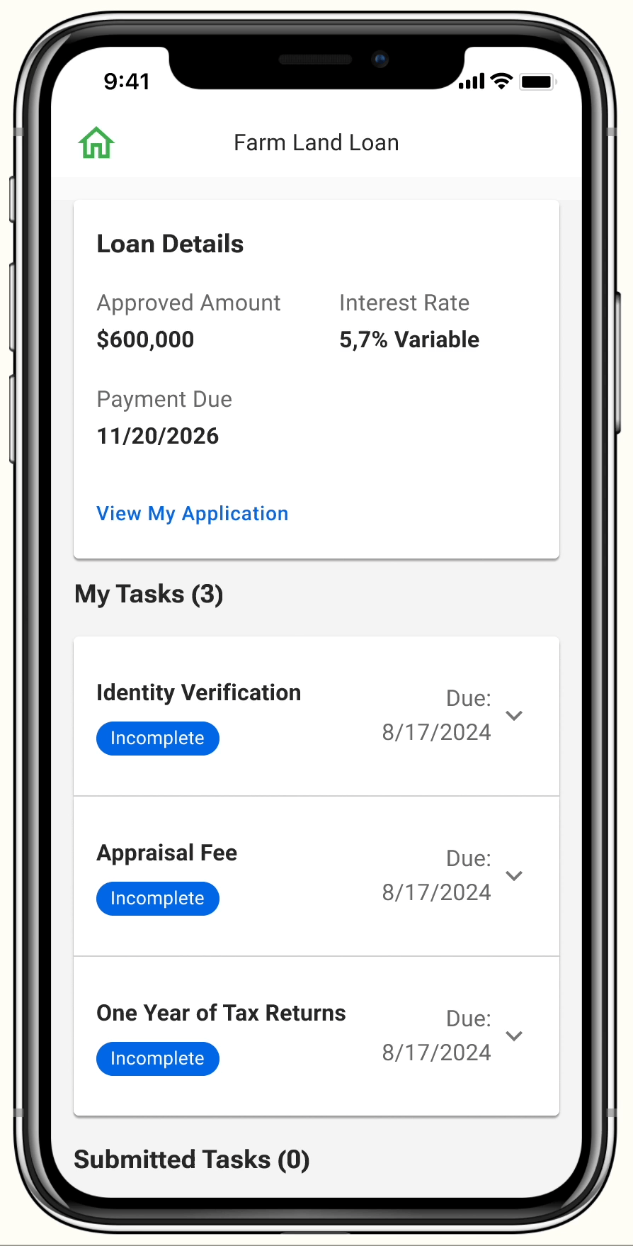
My Applications
The hub for all work-in-progress applications. The status and contextual buttons help inform farmers about the next steps.
Task Management
A centralized place for all the relevant tasks.
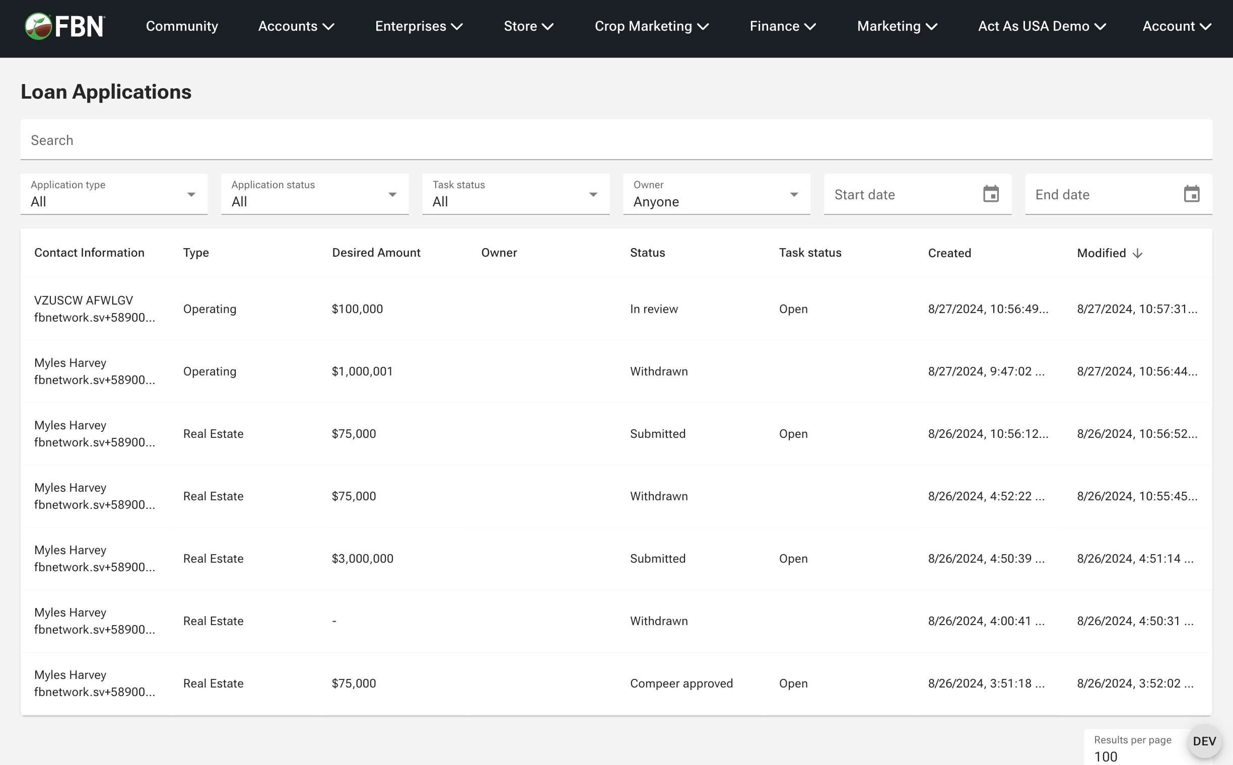
Admin Portal
A place that provides comprehensive visibility into loan applications for the loan team. This provides context when customers reach out regarding their application.
Feedback After Launch
Continuous feedback was vital for refining the product. Post-launch, we implemented post-application surveys, conducted interviews to gather extreme feedback, and organized annual farm visits to engage directly with our returning finance customers. This established a feedback loop that helped us continuously improve and validate our design in real-world settings.
We’ve been running the survey since the initial launch in 2021, the results have been consistently positive:
87%
of farmers find the digital loan experience easy to use

The good and bad of the loan application experience