Problem
Farmers Are Struggling With the Outdated Loan Process
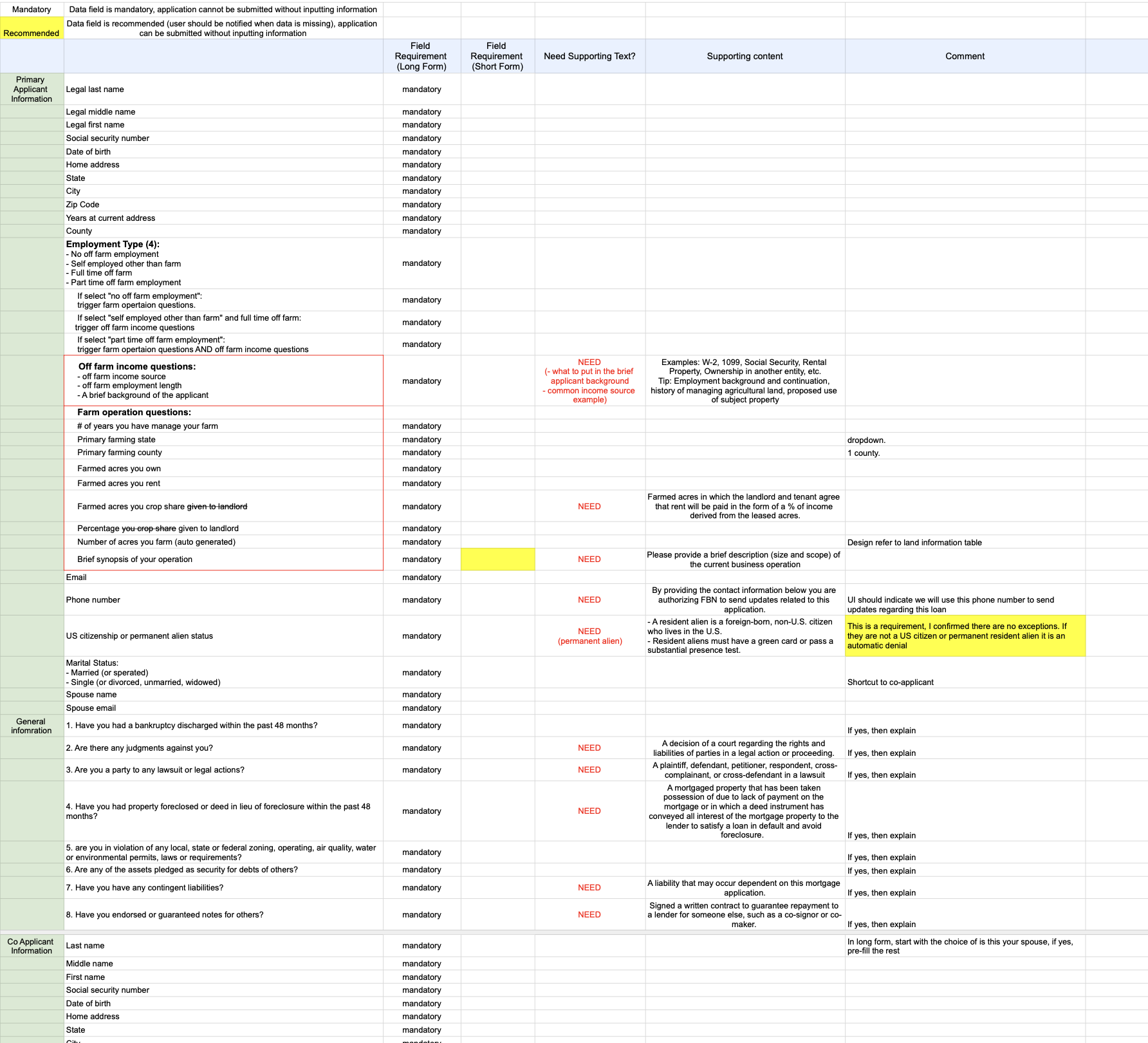
The existing DocuSign-based process was inefficient for both farmers and FBN Finance.
For Farmers
Struggled to complete applications without assistance
Errors led to delays, denials, or increased rates
Complex sections like collateral had no digital guidance
For FBN
Human touchpoints required at nearly every stage
Impossible to scale during high-volume periods
No visibility into application status or bottlenecks
⁈ How might we empower farmers to apply independently — while giving FBN the tools to scale?
Approach
From Pillars to Decisions
With a project this foundational, scope creep was a real risk. To stay focused on the MVP, my PM and I led two key activities:
Competitor analysis — studied loan platforms across retail and ag to identify what worked and what patterns we could adapt
Stakeholder workshops — gathered input from across the business to surface priorities and ensure design decisions would serve both farmers and FBN's operational needs
From these sessions, I distilled the findings into three design pillars — guiding principles that helped us filter feedback, stay focused, and make faster decisions throughout the project.
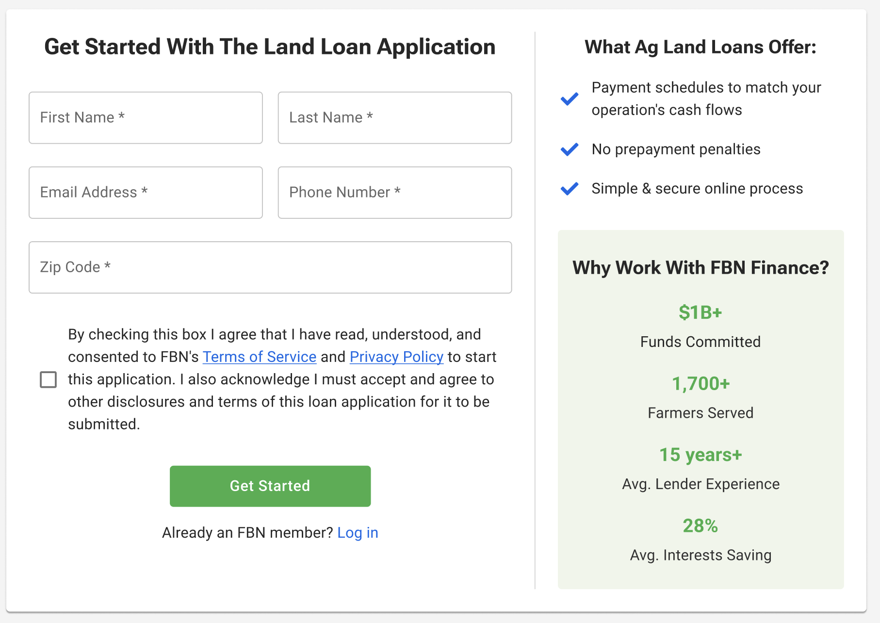
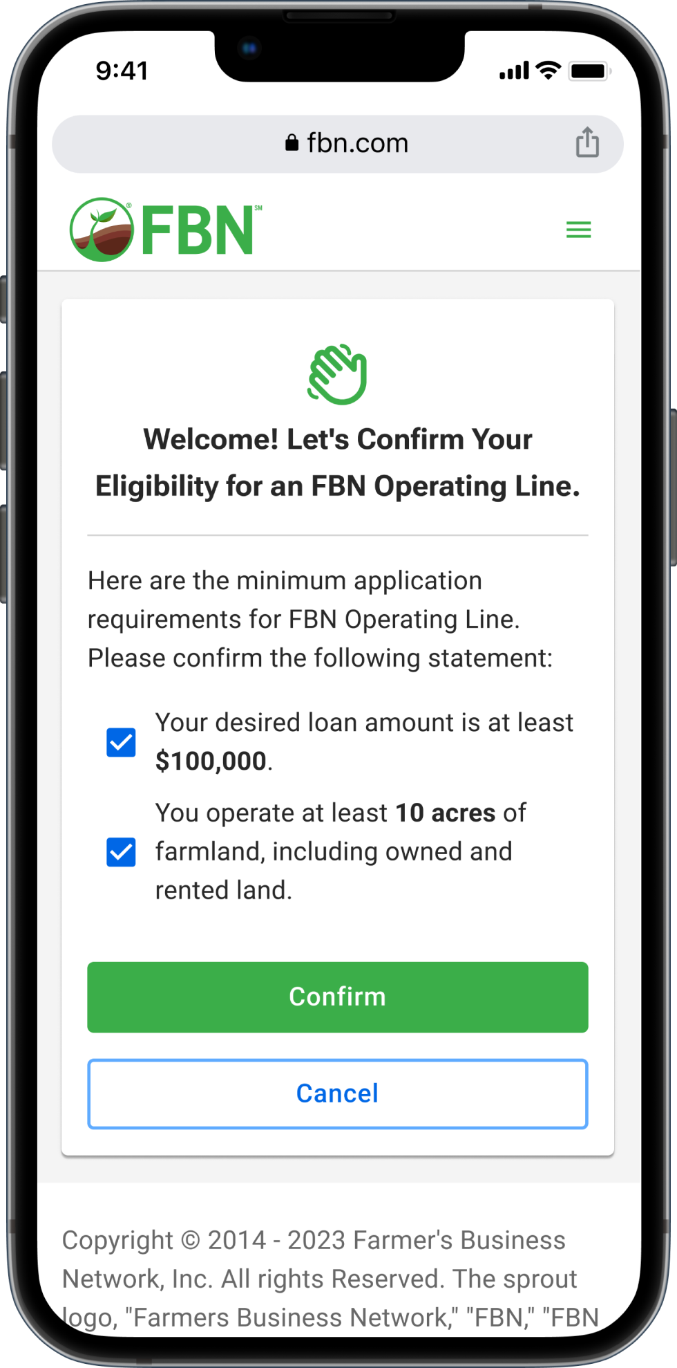
Simplified flow, eliminated unnecessary questions, and provided contextual help throughout the application
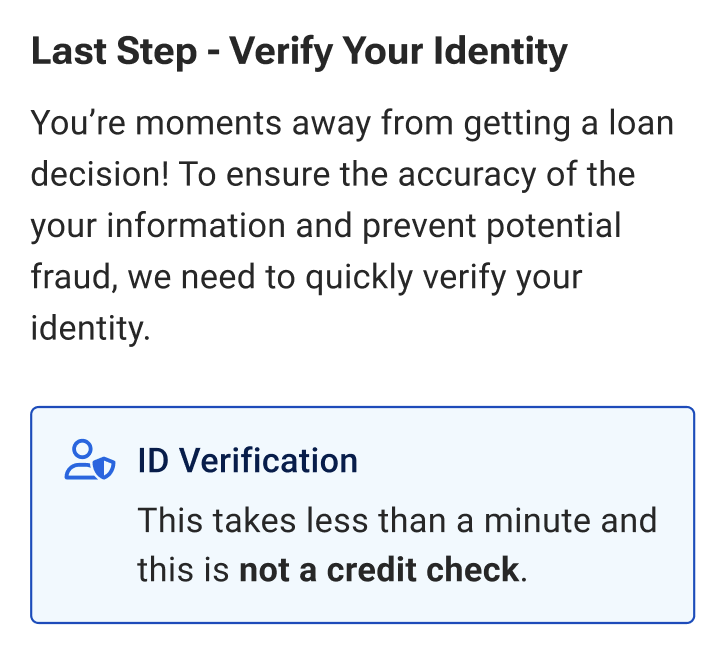
Early identity verification and centralized document upload to prevent fraud and reduce email exchanges
Real-time error feedback and plain language over jargon to reduce mistakes
Design Details — Key Dimensions of Form UX
Content
What questions to ask, how to phrase them, and in what order
Flow
How users navigate through the application step by step
Layout
How information is revealed and presented on each screen
✦ The UX patterns built for this project — steppers, forms, and complex accordions — were later adopted by other teams and added to FBN's company design library, Harvest.
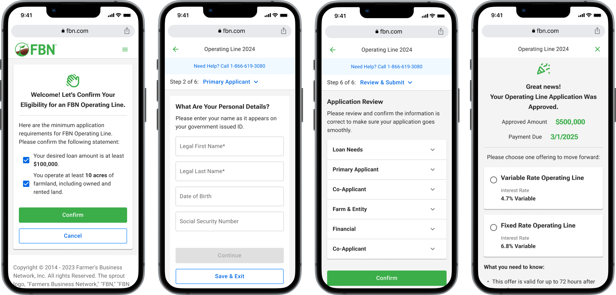
Final Design
The Finished Experience
Click each tab to explore the screens →
Impact
What It Changed
23%
of redundant questions eliminated
10,000+
Farmers reached at launch
87%
Customer satisfaction score (CSAT)